You may also be interested in...
In a Side-By-Side Matrix question, the Gap/Perception Plot can be used to visually represent all the analytical data in one single chart. The details of one dimension (Importance etc.) is plotted on the Y axis and the details of the second dimension is plotted on the X axis.
1. Screenshot
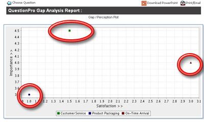
| Customer Service | Top Left Quadrant | High Importance / Low Satisfaction |
| Product Packaging | Bottom Left Quadrant | Low Importance / Low Satisfaction |
| On-Time Arrival | Right Middle Quadrant | Mid Importance / High Satisfaction |
Lets take the above example -- Even though "Product Packaging" has a lower Satisfaction Score here, it's obvious from the chart that it's of lower importance than "Customer Service" -- This XY-Scatter Plot captures both the satisfaction and importance dimension in the same chart visually.
2. Screenshot
